Graphical User Interface Fields and Icons in SmartSolve
Below is a brief explanation of the icons and fields found in the SmartSolve application:
| Legend/Icon | Name | Description |
|---|---|---|

|
Zoom Icon |
Click this icon to go to the predefined field value selection window. |

|
Drop Down Button |
Click the drop down button in the field to display and select a value from a predefined list. |

|
Calendar |
Click this icon to display a calendar for date selection. |

|
Required |
A red asterisk after a field name indicates a required/mandatory field on the form. The user cannot skip the field. |
 or or  |
Section Collapse |
Click this icon to collapse the section. |
 or or  |
Section Expand |
Click this icon to expand the section. |

|
Checkbox |
Checkboxes can be checked or unchecked to enable or disable an option. Checkboxes are also used to select multiple values for a section or field. |

|
Highlighted Words |
Click the highlighted word to link to a file/document or perform an action. |

|
Add Icon |
A row with an Add icon enables the user to add a row to a section or field. The Add icon is also used to add an attachment, report, reference, codes, etc. |

|
Delete Icon |
Click the Delete icon to remove a previously added row or item in a section or field. |

|
Text Box Icon |
Click the Text Box icon to open a text box. The text box enables the user to enter additional text and to spell check the text. |

|
Spell Check Icon |
Click the Spell Check icon to use spell check on the text in a text window. |

|
Select All Checkbox |
Check the left checkbox to select all items in a list and select the right checkbox to deselect all items in a list. |
|
or
|
Radio Button |
Radio button fields are used to select a value or to enable/disable system functions. |

|
Save Button |
Click the Save button to save the data entered in or changes made to a form. This enables information to be saved without having to Complete or Sign-off the information. |

|
Complete Button |
Click the Complete button to finish and save the information entered in a form. |
|
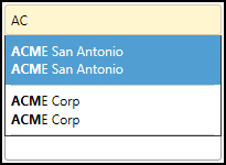
Auto Complete Field |
Some zoom fields also allow the user to type in the field value, if the field value is already known. The application then displays a list of possible options from which the user can select. |

|
Data Entry Field |
Data entry fields allow the user to enter text. |

